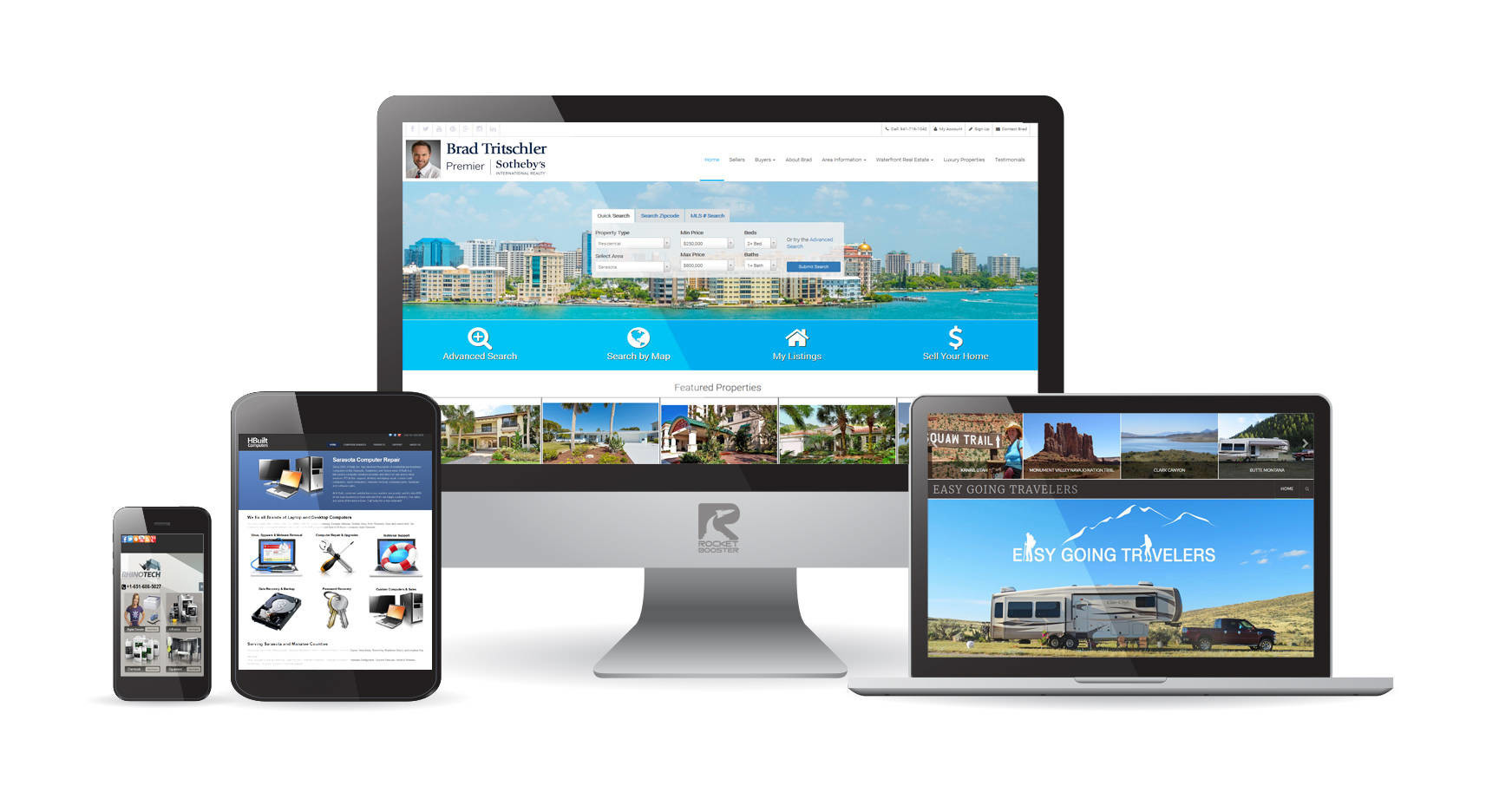
Having a responsive website is the key component to ensuring your company’s success on the web. When clients visit your site they will do so in a variety of ways that includes smartphones, tablets, laptops and PCs. This means your webpage will show up on a variety of screen sizes from hand held all the way to large screen desktops. It is crucial that regardless of what screen size your webpage loads on that it displays and functions properly. If it is not able to work properly across all these formats then you run the risk of losing out on potential customers.
Proper function among ALL platforms, when a website is built to be responsive, it is just that, it responds to the size of the screen it is loading on and properly sets itself up to function for that screen. A responsive design also ensures that regardless of what new innovations come about, it’s ready for whatever screen size is used.
A responsive design allows you to avoid creating a different website for each device that it may be used on. Devices may be in portrait while others are in landscape and some could even be just square. With most smartphones, you are also able to change your screen from being portrait to landscape at the flip of the device. One design is not able to handle all of that, unless it is a responsive design.
By utilizing a responsive design for your business can ensure your company is ready for future technology and clients have a pleasurable experience when visiting. In allowing for a more pleasurable visit you have a greater chance to turn that visitor into a customer. Responsive design, a great way to ensure your company is viewed right regardless of what device is used.